Cyanotyping and Sun Printing
Cyanotypes or sun prints came about in the mid-1800s as a form of photography using highlights and shadows to create a negative that was then reflected on the paper in a deep blue tone. This deep blue was known as “Prussian Blue” and was a highly coveted pigment amongst artists that promoted wealth and prosperity. Sir John Herschel first created the process which was meant as a means of combining his notes and diagrams to create “blueprints”. It became more popular later into the twentieth century for photographic use. Anna Atkins is credited with the more natural style, which includes plants and flowers rather than photographic images. Cyanotyping faded as more photography techniques were created and advanced, but it remained an integral part of photographic history.
The first step in creating cyanotypes is to make sure and have a clear workspace where you can easily transfer the paper or fabric between the water and hydrogen peroxide bath and the chosen sunny area. It is essential to check the UV rays, as this will help the cyanotype to fully develop, creating a white space where the shadows or object lies on the paper. If the UV index is higher, the cyanotype will take less time to appear. This means if you choose a very sunny day your workflow will be more productive and timely. However, it is possible to still create sun prints when the sun is not out. I chose to create my prints on a nice, warm day, which proved effective in my creative process. My goal was to experiment with different kinds of papers and fabrics. I utilized watercolor paper, old book pages, and canvas.
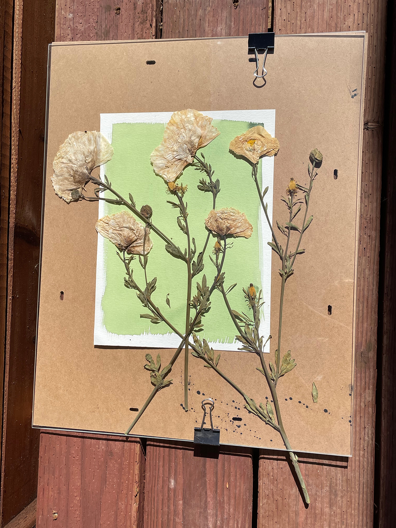
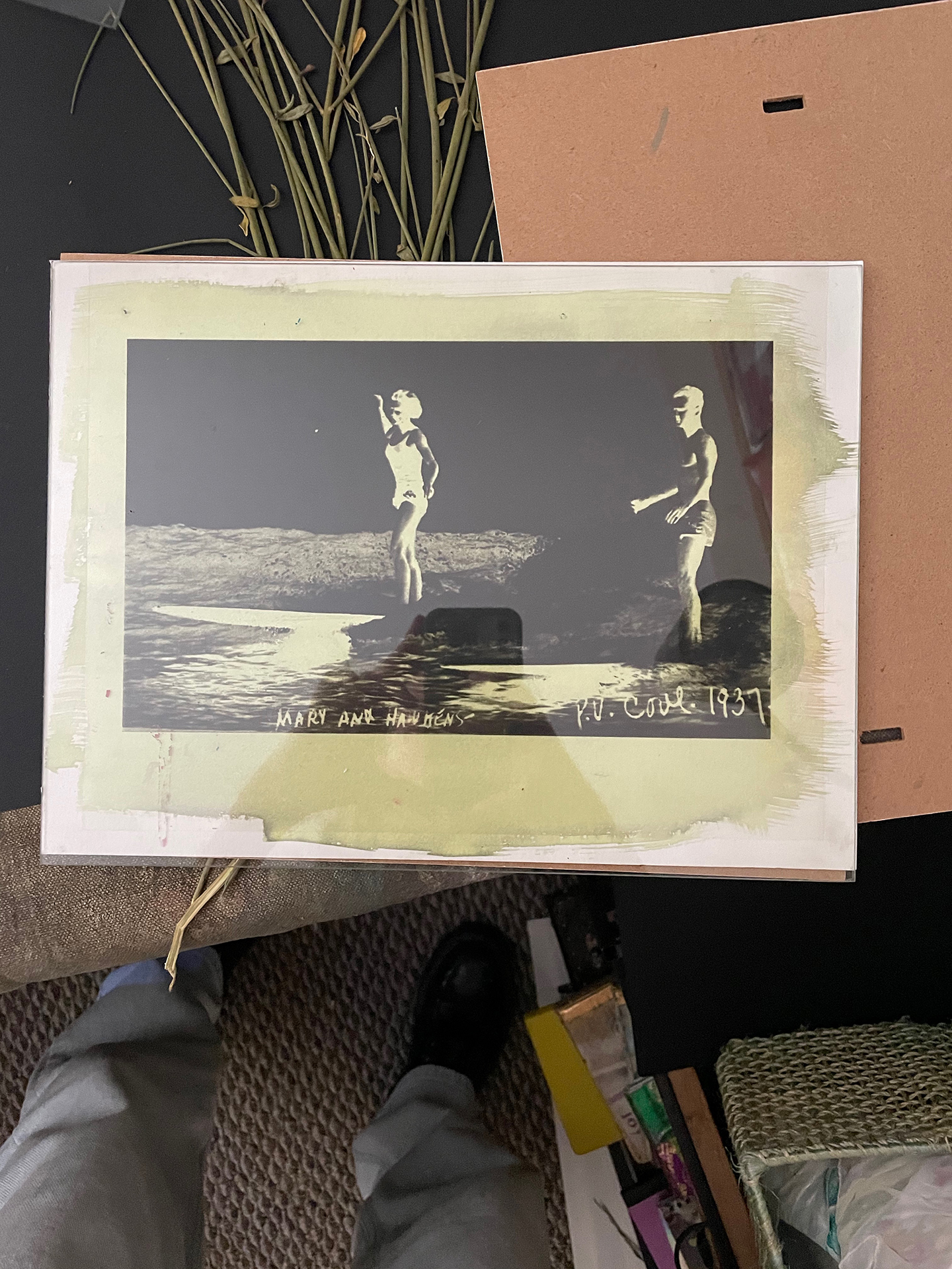
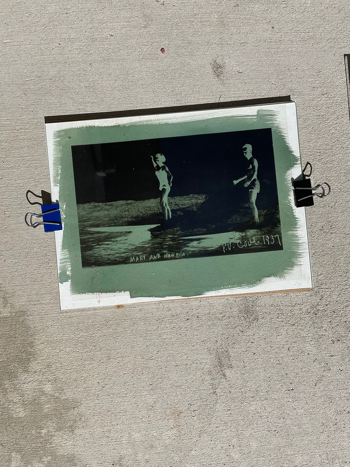
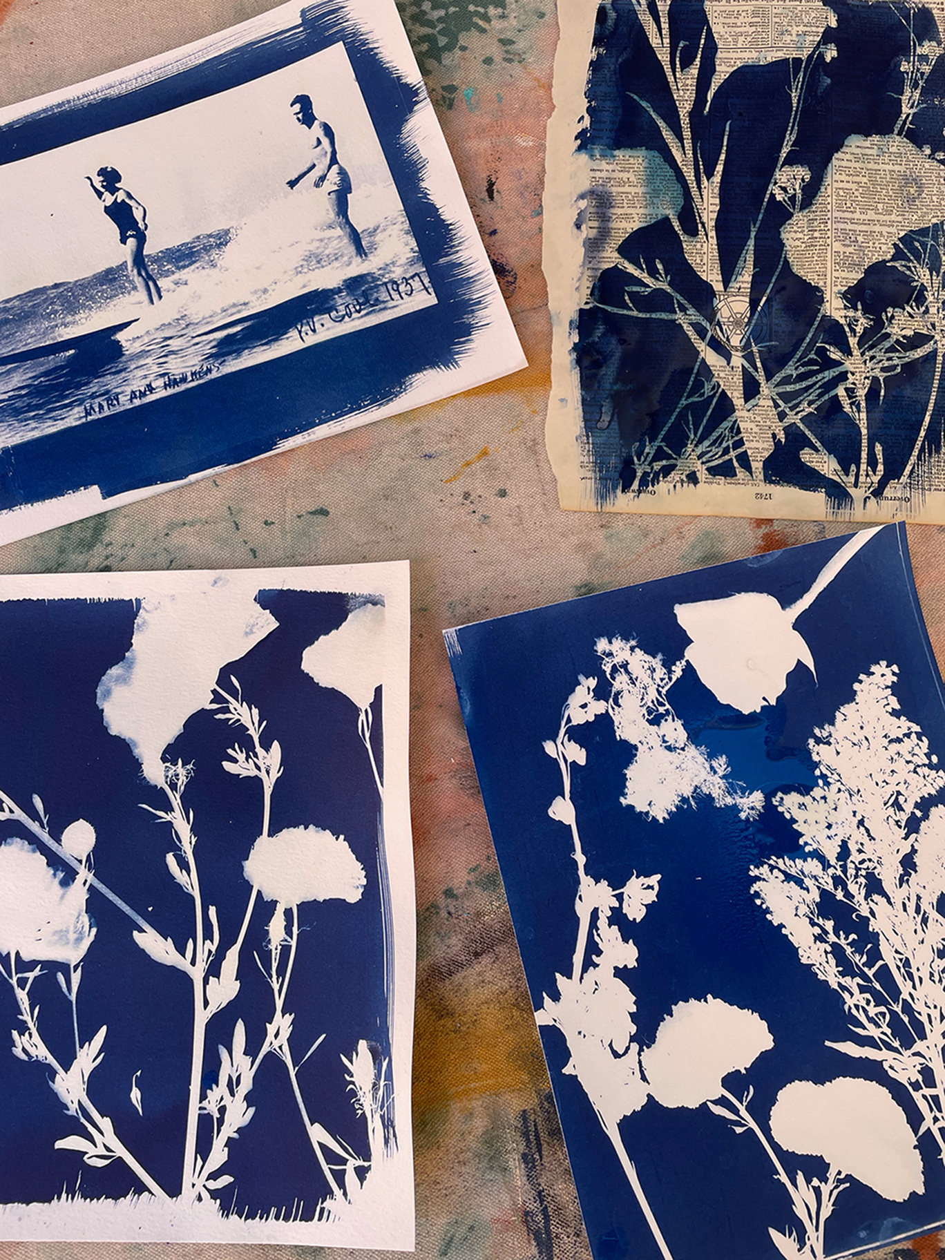
After I decided on my materials that would be used as the backdrop, I sourced my items that I felt would create a nice contrast. It was imperative for my pieces to have variations in shapes, sizes, and textures. Dried, pressed flowers were used to create this effect. I utilized a photograph of two surfers from the 1960s which I manipulated in photoshop to create a negative and printed it on clear, contact paper.
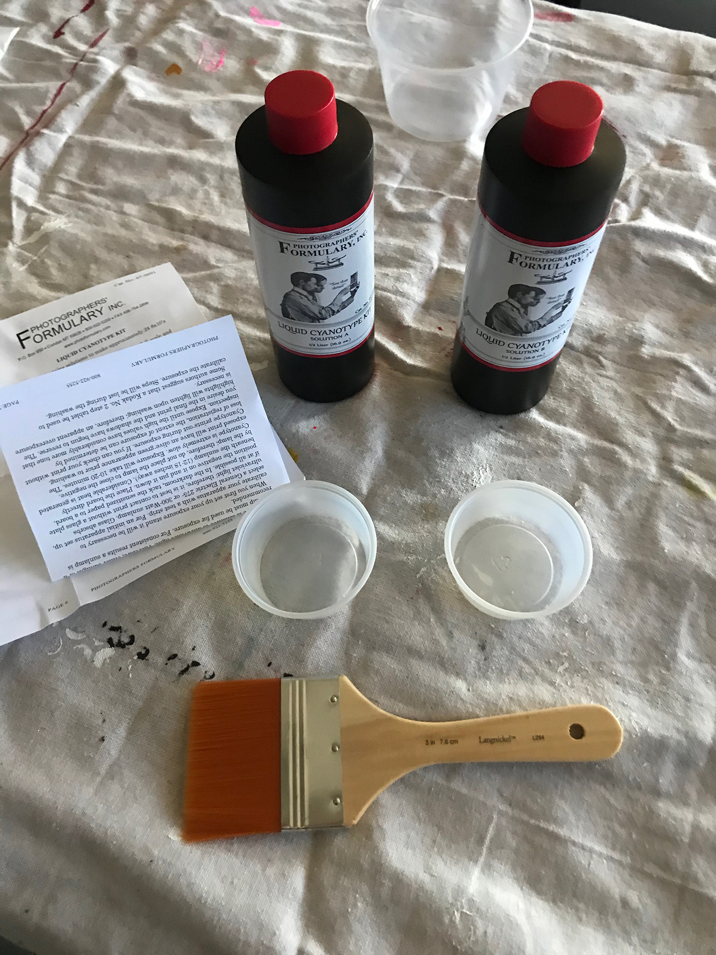
The paper and fabric was then coated in Photographers’ Formulary Inc.’s Liquid Cyanotype Kit, which contained two separate solutions, with a paintbrush. Solution A was Ferric Ammonium Citrate and Solution B was Potassium Ferricyanide. The kit also included Arrowroot Starch and Potassium Dichromate, which can be used to increase contrast within the print. For a softer look, you can dilute the solutions with water. Solution A and solution B are combined to create a coat for the paper, which must be done in low light as to not trigger to development process. The solution is extremely sensitive to light, so it is imperative to keep it away from any ultraviolet light. I allowed my paper and fabric to dry in a closet overnight, so there would be no excess light shining on the paper.
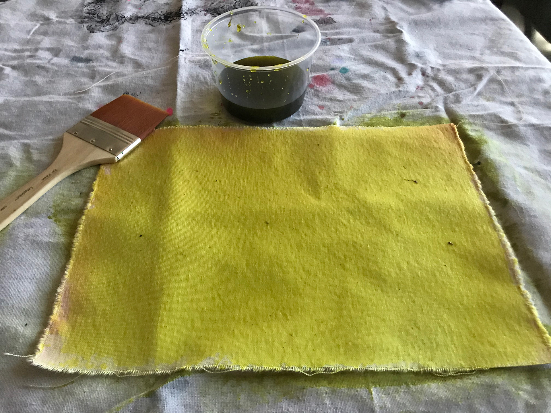
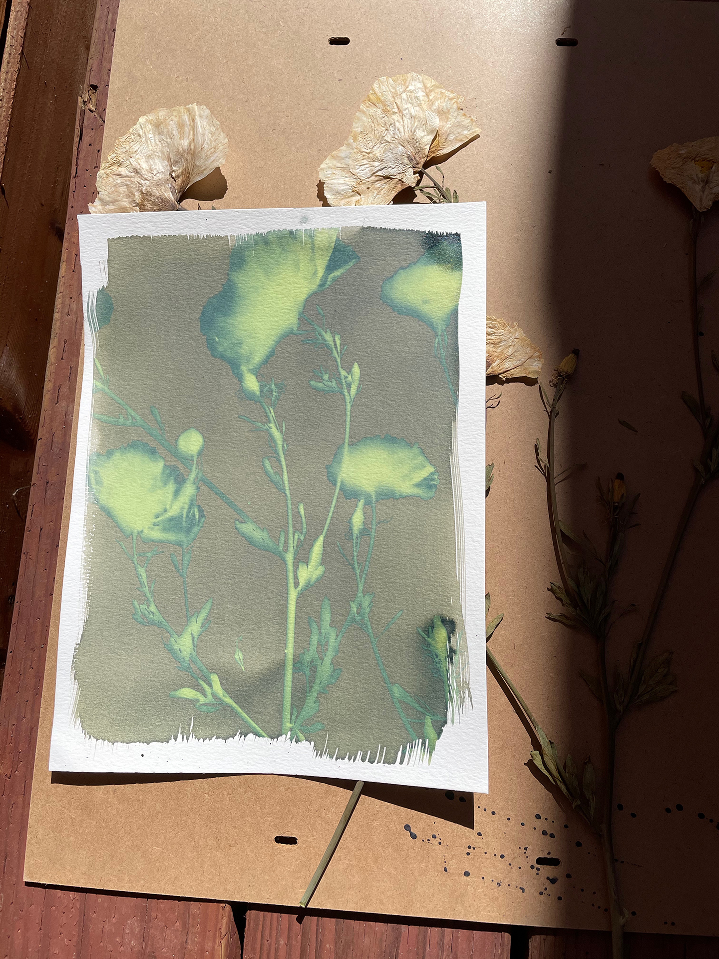
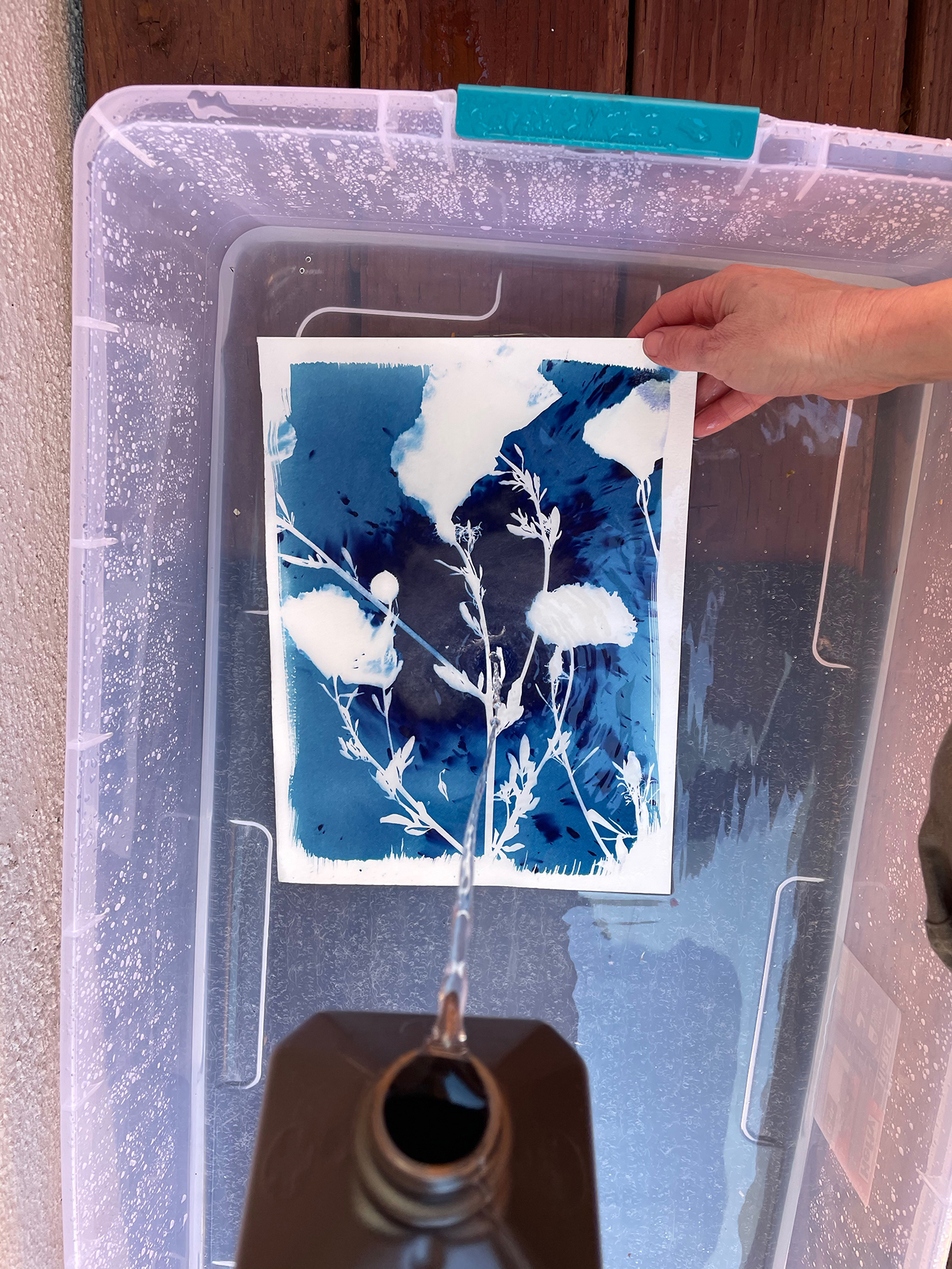
When I pulled the paper and fabric out the next morning, it was a greenish-yellow color. This color can be manipulated, as well, to be more green, violet, or brown. In a dimly lit room, I then began the process of composing a piece on top of the back of a frame with one of the watercolor papers. The frame helps to keep the flowers and leaves in place so there is a more even, clean shape. I secured a piece of glass on top of the piece to provide another level of security and took it outside to develop. It was about 2:00 p.m. I let the first test sheet sit in the sun for approximately seven minutes, as I watched the bright greenish-yellow fade to a muted green. The glass was removed and I dunked the paper in two separate baths: one with distilled water and the other with distilled water and hydrogen peroxide. The hydrogen peroxide works as a sealant and alos helps to deepen the cyan color, creating a beautiful contrast between the white outlines of the flowers and the blue background. I placed the paper in the distilled water first to activate the blue and then the hydrogen peroxide and water bath to seal the color. The paper must be rinsed for a few seconds after to rid it of any hydrogen peroxide.
I was very pleased with how my first print came out and felt it was time to experiment with using a photograph. As mentioned earlier, I created a negative in photoshop and printed it on clear film paper. The same process is repeated as before. This print was interesting because there were more opportunities for lighting contrast within the image. Instead of having a completely white shape there we more complexities in the execution.
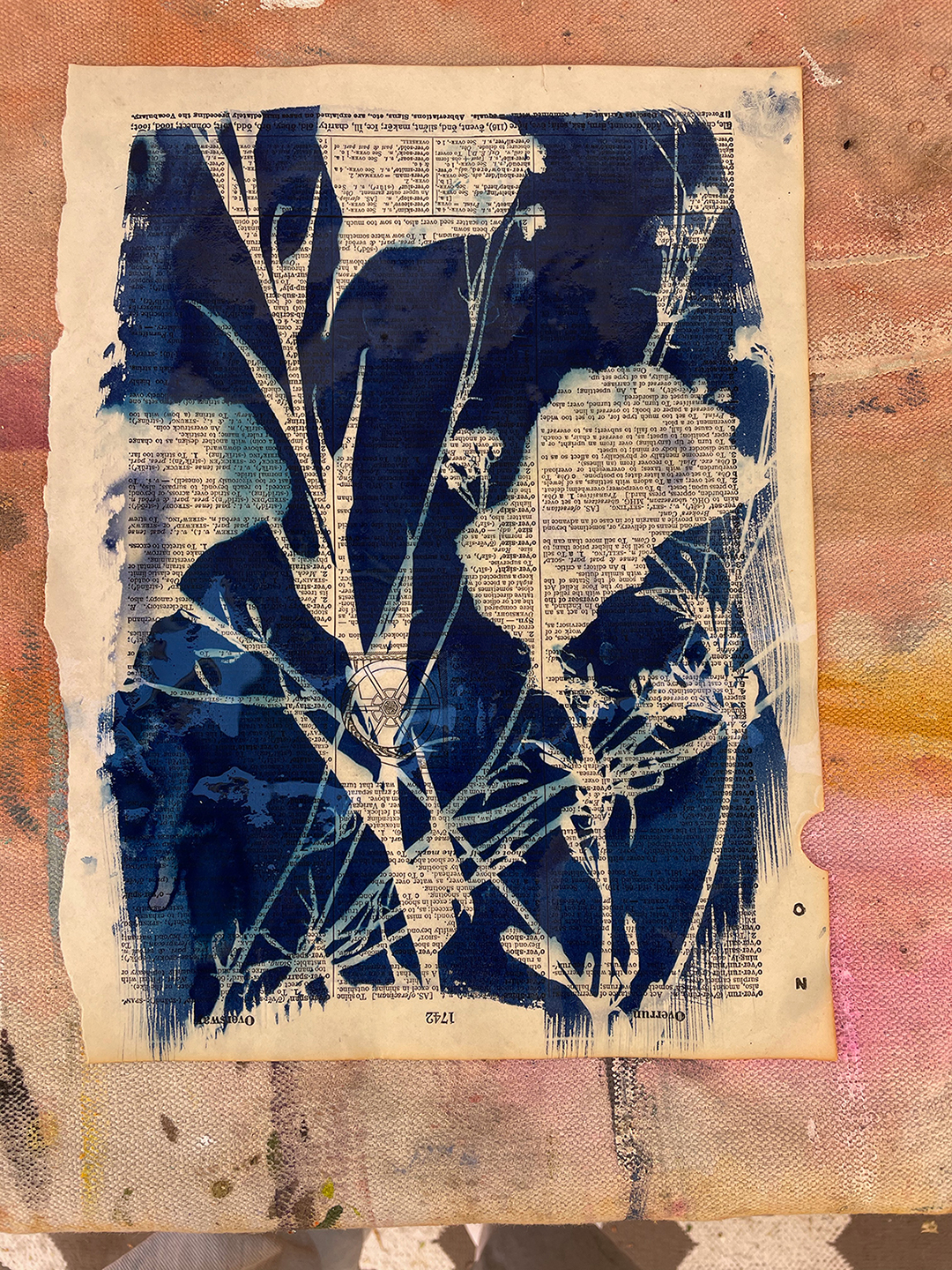
The old book page came from a vintage dictionary that my mother picked up at a flea market a few years ago. The paper is easily tearable and very fragile, so I was unsure if the process would work on this type of material. I repeated the process and found this to be my favorite print. The addition of the words inside shapes gave it a more weathered, vintage look that I felt created a more aesthetic appeal that wasn’t apparent in the other pieces. The canvas, as well, made the image less defined which produced a more artistic product versus the negative image.
I found that there were many areas in the prints where the cyan bled into the white areas, causing the shapes to be more fluid, which if manipulated, could be utilized to make a variety of shades of cyan. The differentiation between fabric and paper types proved to be less difficult than I assumed. I believe that the key to creating a clear sun print is to leave it out for the perfect amount of time, which is somewhere between five and eight minutes, and making sure the materials or the negative does not move in the process.
Overall, cyanotyping is a simple process that many people were able to pick up in the early stages of photographic printing. Chemicals are more accessible now and much safer than that of the early 1900s. Although sun prints are not as popular for printing images these days, they can be utilized for aesthetic purposes and manipulated to create a engaging and unique piece of art.